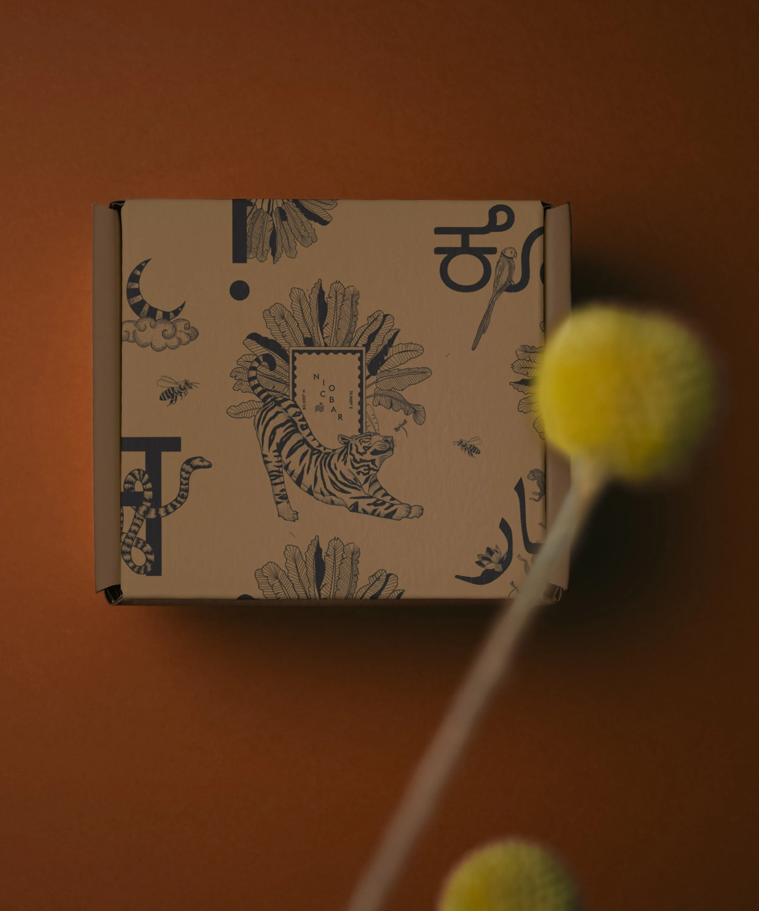
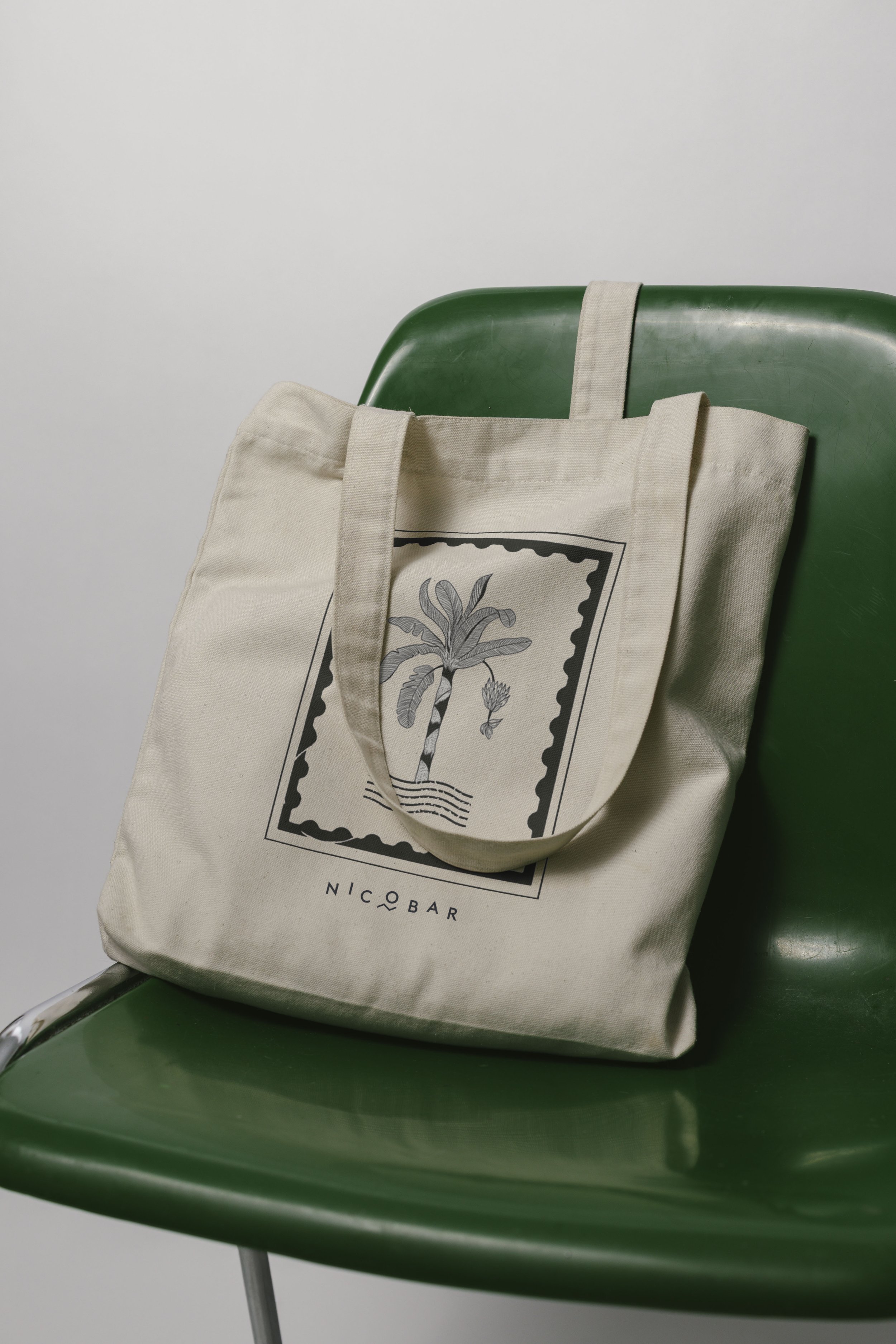
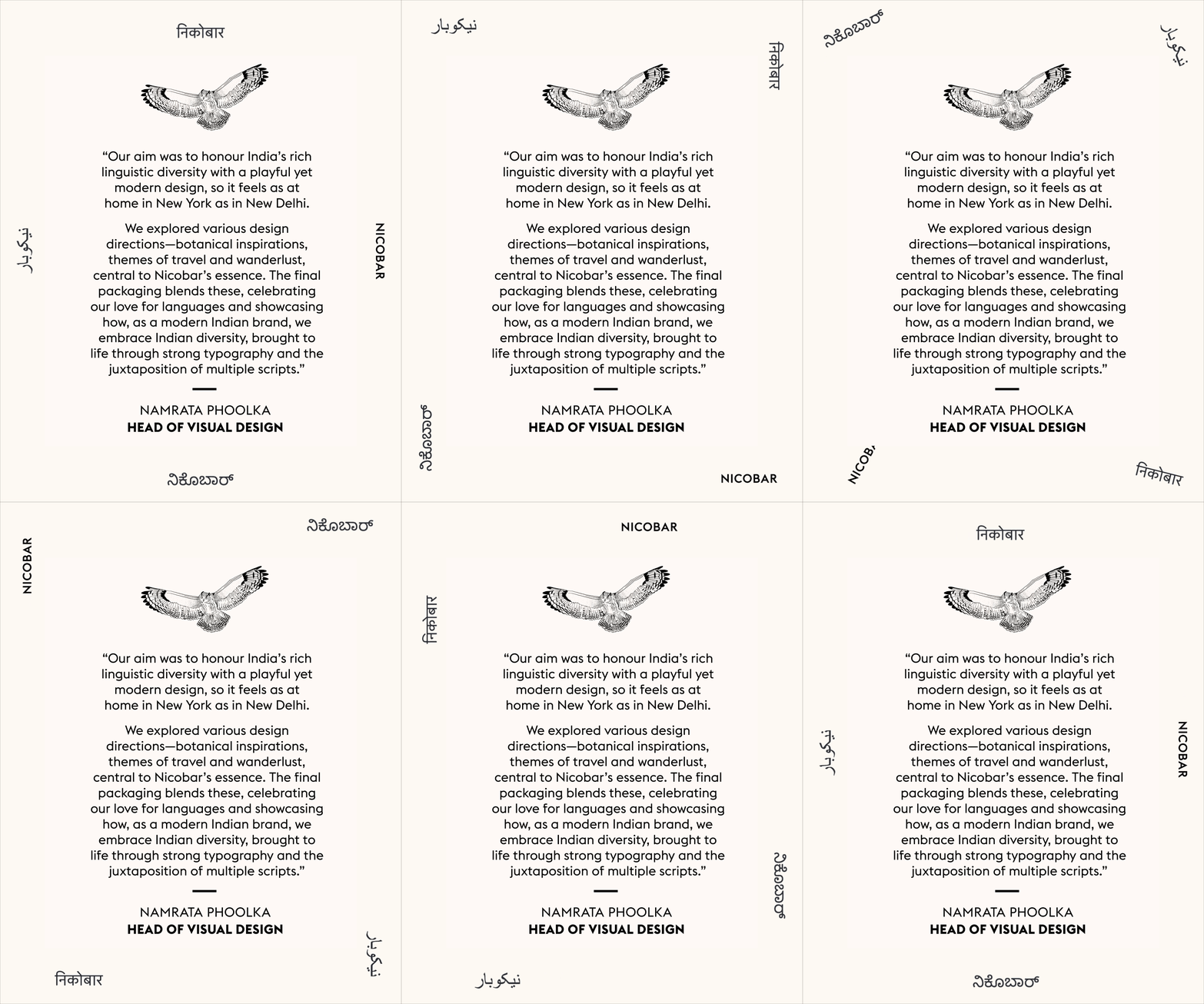
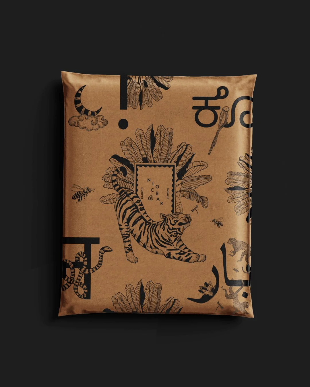
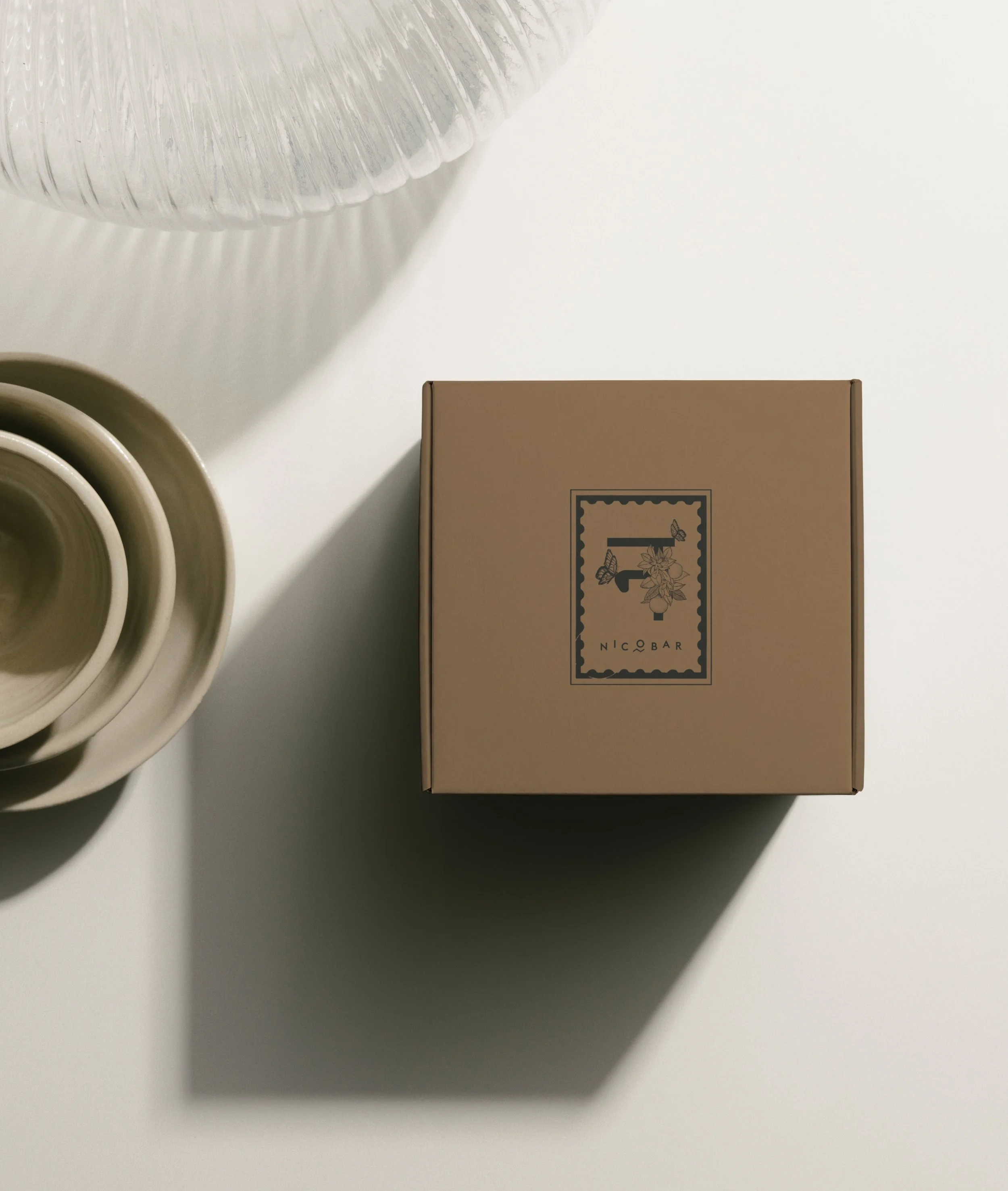
Creative Direction for Nicobar's packaging redesign encompassed the conceptualisation of the packaging system, visual language, and material direction. Conceived around the idea of Love From India, the packaging identity was rooted in the brand's values, celebrating India's linguistic and cultural diversity through a design language built on multiple Indian scripts interspersed with Nicobar's signature animal motifs. Kraft paper was selected for its tactile, organic quality, while a restrained palette of charcoal grey and indigo blue ensured that typography and intricate motifs remained central to the design. The resulting packaging is a distinctly cross-cultural and diverse expression of Nicobar's design philosophy and its roots as a contemporary Indian brand.